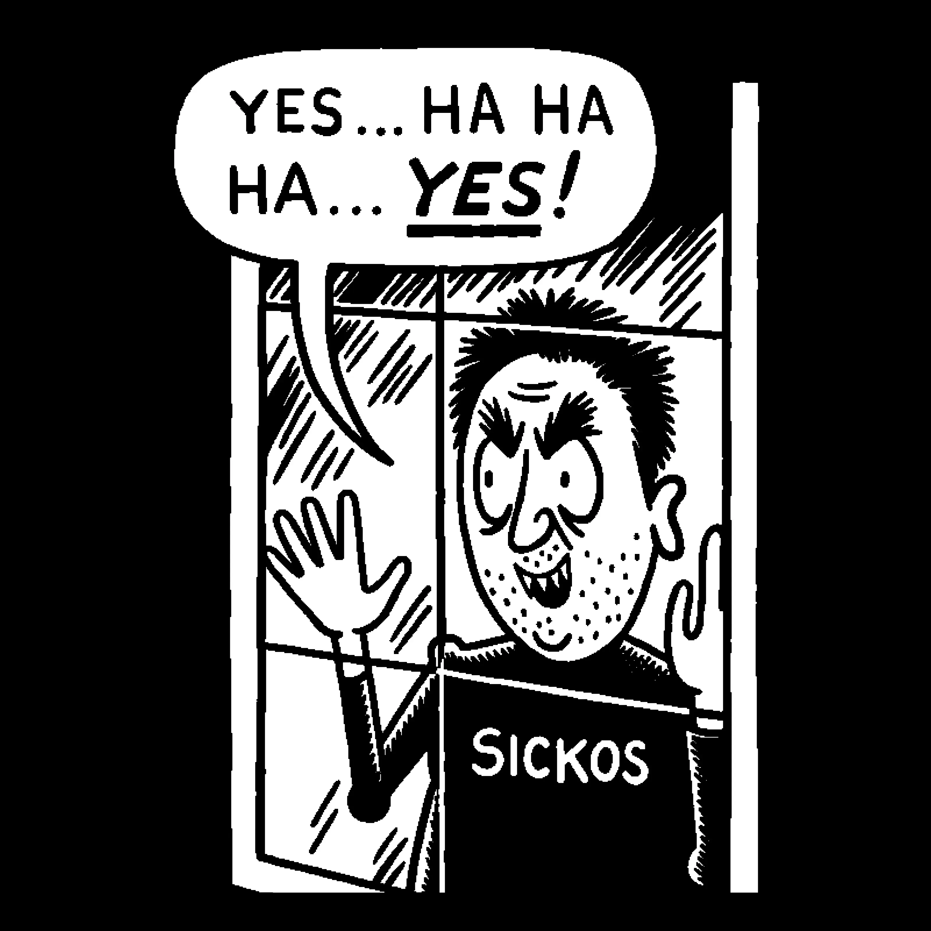
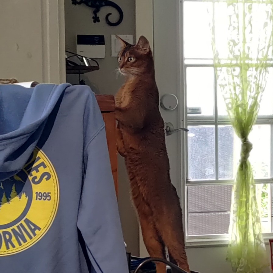
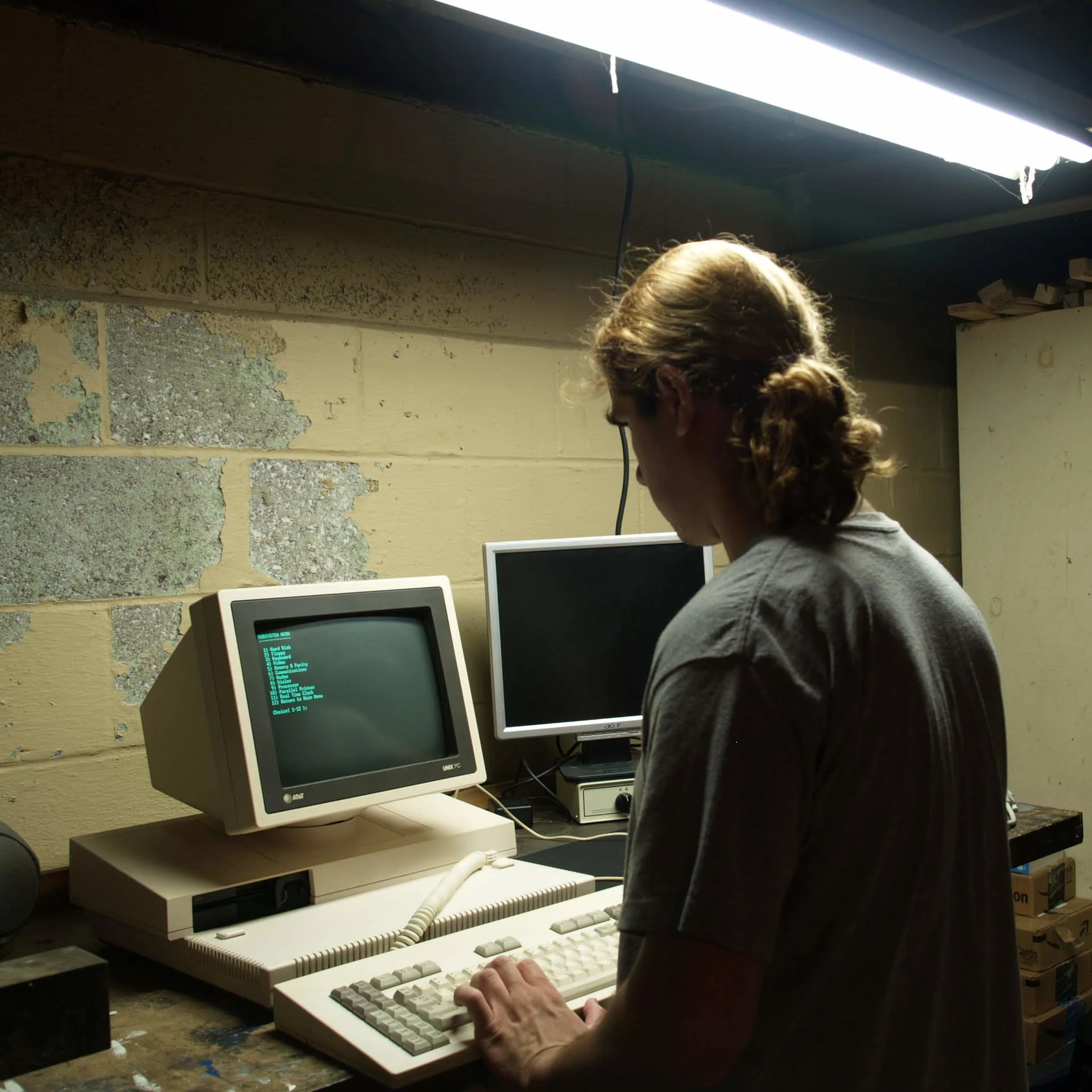
I don’t even know what it’s called, but I really hope it goes the way of Comic Sans
Edit: does anyone actually know what this awful font is called?
It’s apparently not just limited to English. Not that it would be, guess I just never thought about it.

Octoberfest this year had a lot of stands, all with the same AI slop posters. I bought a burger from a stand with just a handwritten sign. Felt good.
What gets me is they’re all the same style. Do they not see that their posters are the same as everyone else’s??
Anyone competent enough to understand that effort is a vital component of modern marketing is already steering clear of AI slop nonsense. It’s the stupids that are left believing that doing something as cheaply and easily as possible won’t reflect poorly on their business.
and good lord there’s a lot of stupid people out there.
I have a lot to say about how and why, but i think these people though their posters looked good before they saw everyone have the same style.
Like how Walmart and Target are competitors, but their themes complement each other as to what we expect from their stores. It’s something a successful business can’t ignore. See power tools brands have all cornered their respective color theme, but up close they all perform similar to our expectations before anything else.
So AI steps in, advertised it can make posters now, and people believe it. Either they can’t afford an artist, or don’t care enough to consider. Swaths of salt-of-earth businesses jump to use it, naively, and kinda out themselves accidentally as the amateurs they are.
Everyone sees it, and realized too late. I think that style will die off pretty quickly if business owners know what’s good for them.
It’s just so absurd that AI as a solution is just again, seen as another poison to the thing it’s supposed to solve. If I were to write a story about it, I couldn’t make it up. The absurdity has it’s own gravitational pull.
You have far too much faith in taste.
They each probably thought they had this great idea of getting a crazy unique AI sign before they showed up and saw that everyone had the same idea.
I see more or less the same at craft fairs: lots of the same stuff, lazy dad crafts, lazy mom crafts (done at scale). All following the same toktok or Instagram trend.
To the signs thing, I think I’d rather see a generic stencil and spray paint sign. At least that’s real.
Is that some AI clone of Oktoberfest?
Comic Sans was hand-crafted, technically excellent, highly legible and served it’s purpose perfectly. The only thing it has in common with this shite is that people used it for fucking e-v-e-r-y-t-h-i-n-g.
this is an insult to comic sans; that ai font is way worse than it
I love comic sans just because it’s the easiest to read. I write everything in comic sans and then reformat afterwards.
Is there a monospaced version of comic sans for programming?
Yes: https://dtinth.github.io/comic-mono-font/
I used it for a while thinking it helped me, but actually turns out I just needed a bigger font size
This fucking shite

Those faces in the bottom left corner are horrifying.
Mouths of a feather slop together
So many fingers
No bottom rows of teeth in sight
What on the fucking love of God is eBay live? Do we not even pretend anymore that’s content and go straight to TV selling channels?
Tiktokification. Every app has a reels clone, because that shit is addicting and works at keeping people engaged.
eBay is jealous of Whatnot and is trying to copy them
What?
not
Goodbye

Sloppy sans
It’s either this shit or the fucking humanoid robot in every tech related post touching a holo screen showing completely pointless and unrelated data

The explosion of shitty illustrations attached to every tech article has been so hideous to behold. Somehow even worse than the fact that so many of them are totally pointless slop.
I’ve been absolutely shocked walking through city centers and seeing these fucking AI flyers everywhere. Boycot whoever uses this shit and pay your local artists and graphic designers.
I am in Japan right now and they were selling postcards with AI images. Not even art made by humans…
I’ve seen that in a city I visited, three seperate shops with those and people were still there browsing
This is an insult to Comic Sans
Yeah, Comic Sans is actually useful.
This ! This is the exception for the rule : never slop

I’ll be honest, I didn’t make it, but looking at it I can’t tell if it’s actually slop or not. Looks like two standard photos side by side with text overlaid and a mic png
I don’t see why you are getting downvoted. In any case, the hand and the form of the shadow people is pretty much the only blatant giveaway. Its getting near impossible though, especially if someone simply modifies the giveaways away.
I’ve been frustrated with Lemmy’s trend of downvoting people when they struggle to tell if something is slop. Usually it’s from some genuinely trying to learn how to spot the giveaways. What does downvoting someone trying to learn accomplish?
I’m with you. I post a shit ton, so all I see are fucking cats telling me slop is bad.
Fortunately, someone taught me about this: https://www.zerogpt.com/ about a week or two ago and it’s been helping. It’s still cumbersome to use given the speed at which I find and post memes, but at least it’s another tool I can rely on somewhat.
For a potentially better tool in many cases, you can use one of the official SynthID detectors. It only works for OpenAI and Google at the moment, but Anthropic is supposed to release their watermarking detector soon as well.
Look closely at the mic. Why does the grille look so organic and asymmetrical?
Look at that skyscraper. What in the hell is that blue thing on top of it?
You just have to look for like 3 seconds to see that this is slop.
I saw a funny poster that was in the style of a LLM generated event promo poster that was actually all disparaging text like “no one is going to read that shit” and “this is actively causing people to avoid your event”. I felt that was borderline and decided not to post it here.
I dislike the font, but I REALLY fucking hate what they’re doing with food. It’s like they’re all using the same horrible model that has never seen hashbrowns and BBQ sauce. You ask midjounrey for a steak, it makes you a convincing steak. It’s like every restaurant in every country is set on tryptophobic food
The essential qualities of a good typeface balance visual beauty with practical function. This is just plain ugly and makes Comic sans look elegant. Using this crud is as acceptable as attending a funeral dressed as a clown.

That’s more like using Comic Sans for the obituary
I know multiple people that would want clowns at their funerals
My grandfather was a clown for the Shriners, and he literally had clowns at his funeral! He was also the first balloon twister I ever saw. He started back in the 60s, twisting balloons into dogs for sick kids in hospitals, dressed as a clown. He was a special guy.
Juggalos?
Comic Sans was - is - a frigging superb font. It was destroyed by being abused.
I personally didn’t think Comic Sans was bad, just overused, especially in contexts where it didn’t belong. (Funeral homes should have been banned from using it by industry regulation. They never did that. Anywhere in the world. This is why we need multinational legislation.)
This font, whatever the hell it is called, besmirches the good name of hand lettered sign painting and advertising that was common in advertising before computer typography. Have you seen old hand lettered ads? Unless they were in great hurry, they never left brush edges visible to this extent. It looked sloppy.
Best use of comic sans I can recall was the OG Higgs boson discovery presentation in 2012
Yeah, that’s always the exception to the rule.
If you’re going to give a presentation that will change the world as we know it for the better, well, nobody gives a shit what font you will use. Go wild.
When OP said they wish it goes the way of Comic Sans, the first thought in my mind was that it would be used in a bunch of doctors’ offices. Not sure if I would want to be treated by Dr. McSkateboard
It’s especially important to understand that in the early days of computing you only had a single system font or a tiny font pack of less than 10. Microsoft used a tiny pack that had Arial as their sans-serif, Times New Roman as their serif, Courier New as their monospace, and two symbol fonts. Of the three real fonts, two were incredibly computery, leaving Times New Roman as the friendliest font available.
Microsoft then set out to make a family-friendly cartoon-themed OS and set the entire OS in TNR. One of their designers took issue with it and designed Comic Sans to be a viable OS font that felt friendly and suited comic art. He was a bit late in starting, so it shipped with TNR and immediately failed, but Comic Sans ended up shipping with some versions of 95, then became a default font in Internet Explorer and Win98. As a result, it was the only friendly font on the average computer for ages.
Oh, I guess I never realized it was supposed to be brush painted letters. I figured it was just trying to be edgy
Speaking of edgy, long time ago, this sort of font was vaguely about “anarchism”… Actual anarchists were like “well I guess it passes for graffiti, but for real typography, you need real typography. Look at this perfectly rendered Ⓐ, holy shit that’s so geometric, fucking epic, right?”
Once GamerGate hit, I took one look at the “Alt Right” subreddit, saw they used punk aesthetic nonsense vaguely like lazy hand lettering stuff, and was immediately convinced they would not know punk if it bit them where it hurt (their monthly allowance from their parents).